Writing styles
You can use any styling approach you prefer:
Tailwind, CSS-in-JS, inline styles etc. However,
we recommend using SCSS modules as it allows you
to use the same breakpoint rules as the ones that
are configured in Control. We recommend you get
familiar with how layouts/breakpoint work in Control.
Visit Project Dashboard -> Design -> Layouts to see
your current layout configuration.
Problem
Let's say you're building a custom slider for a project
that has three layouts: Mobile, Tablet and Desktop.
Note the layouts configuration is also editable. You
want the slider to have different style rules for all
those layouts. But if you just copy-paste the values
from Control and and hard-code them into your code, the
next time a designer visits the Layouts config in Control
and changes the breakpoints - your code won't reflect
those changes.
Solution: a CLI that generates .scss file
We've built a CLI tool that generates a single .SCSS file
based on the layouts configuration in your specific
project in Control.
This generation happens every time a project gets built,
therefore it guarantees that the style variables are always
up-to-date. It's also set up on a pre-build job, but you can
trigger it manually by running this command from your
project's root folder:
npm run generate-layouts
By default, if you don't pass it any options, it will create
the following file: styles/cntrl.scss. You can change the
location and name of the file by changing the script in your
package.json.
How to use the generated mixins
The generated file exports a single mixin called for() {}
and a function called size().
Let's see how we can use them in combination:
@import 'styles/cntrl';

.my-class-name {
  // common properties
  position: relative;
  // END common properties
  @include for('mobile') {
    padding-top: size(75);
  }
  @include for('tablet') {
    padding-top: size(192);
  }
  @include for('desktop') {
    padding-top: size(144);
  }
}
Let us explain them in detail.
This for() {} mixin takes a single argument - it's the
layout name that corresponds to the layout name in Control.
Calling the size() with the same value will return different
result based on which mixin you're wrapping it with.
Let's take a look at this configuration in Control:
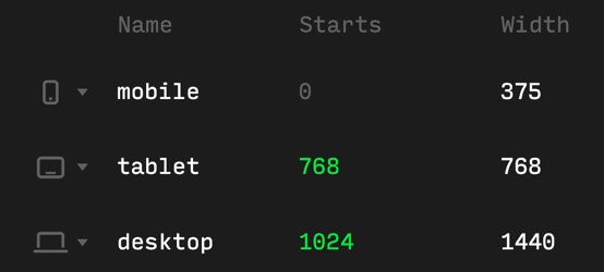
The top padding for mobile will yield to 20vw:
@include for('mobile') {
  padding-top: size(75);
}
75 / 375 * 100 = 20vw.
Let's see how the full code block will look like when
fully transpiled to simple CSS:
.my-class-name {
  position: relative;
}
@media (max-width: 767px) {
  .my-class-name {
    padding-top: 20vw; /* 75 / 375 * 100 */
  }
}
@media (min-width: 768px) and (max-width: 1023px) {
  .my-class-name {
    padding-top: 25vw; /*192 / 768 * 100*/
  }
}
@media (min-width: 1024px) {
  .my-class-name {
    padding-top: 10vw; /*144 / 1440 * 100*/
  }
}