Custom components
One of the ways to customize Control page with your code
is adding Custom Components.
Custom Components allow you to define a placeholder
within a page using Editor and render a fully hand-coded
React component version of an item.
In Beta, users of an Editor will not be able to see the
registered component - it will only be visible on
a published page.
Adding Custom components
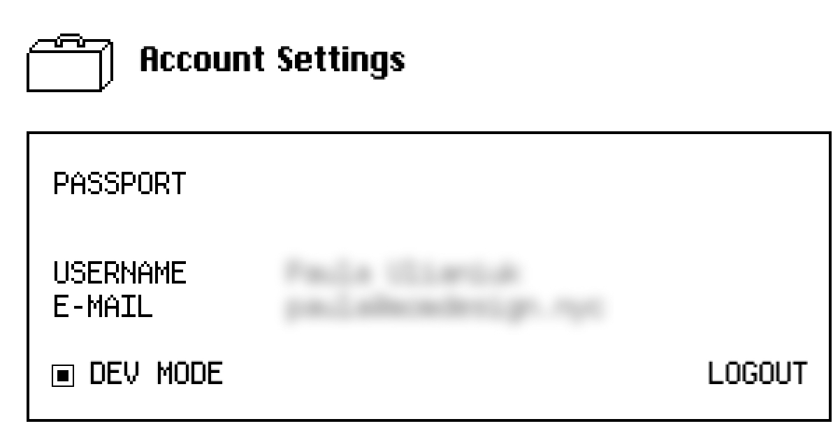
- Go to Account Settings and make sure the "dev mode" is enabled.

- In the Editor, go to any page within your Control project.
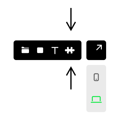
- In the toolbar in the top left corner, click on the puzzle icon

- Drag on the page to create an area
- Name your custom component by double-clicking on it
- Publish your site in the Project dashboard
- Create a React component in the
/componentsfolder
and export it - In the codebase, navigate to
_app.tsxand add the
following code:
pages/_app.tsx
import { customItems } from '@cntrl-site/sdk-nextjs';
import { YourCustomComponent } from '../components/YourCustomComponent';

customItems.define('your-component-name', YourCustomComponent);
Done! You should see your custom component after running
npm run dev and navigating to the page where you use it.